I created a new site that helps visualize data from the National Transit Database, which historically has made its data very difficult to parse.
For a little background: all transit agencies which receive federal funding must report a certain amount of data to the Federal Transit Administration’s National Transit Database. The FTA publishes two series of data: first, a spreadsheet of monthly ridership data, which usually lags by about two months. This spreadsheet has limited financial, ridership, and vehicle data for the each agency’s fiscal year, usually about one-and-a-half to two years prior to the present date. Second, the full NTD, which reports a high level of data about each agency, spread out across about 20 excel spreadsheets. The full NTD for each year (2016 is the latest available) contains financial (operating and capital), ridership, fuel/energy usage, and vehicle data.
In the past, when comparing different modes of transit and their financial costs, it has taken a lot of time and effort to just parse the spreadsheets and find the data you need.
My own National Transit Database site, which went live this week, is a start in parsing that data and making it more available. It’s meant to be user-friendly and visually informative.
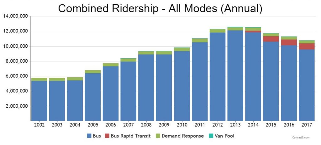
For instance, take a look at the page for the Interurban Transit Partnership (The Rapid), in Grand Rapids, Michigan. I created a chart that shows overall ridership across all modes of transit provided by The Rapid, as well as breakdowns for each mode.

For each individual mode of transit (for instance, bus, bus rapid transit, demand-response, etc) there is a tab with financial data. This tab pulls from both the monthly ridership spreadsheet and the full NTD data for the latest fiscal year (in this instance, 2016). Included is ridership, the number of passenger miles, average trip length, total operating spending, total fares received, total depreciation, and a breakdown of the cost of providing each ride and the total amount of subsidy required to provide that ride.
For the depreciation number, I had to estimate the amount of depreciation attributed to each transit mode because for some reason the NTD spreadsheets don’t break down the depreciation amount on a per-mode basis. Oddly, that’s one of the few bits of data in the NTD that isn’t broken down by mode. You can review the depreciation data in the Operating Expense Reconciliation spreadsheet. Therefore, I estimated each mode’s share of depreciation by allocating the depreciation amount based on the number of trips each mode represents as a portion of the total number of trips provided by that transit agency. Adding depreciation gives a much more accurate picture of the cost of providing a service because that includes a fair cost of the capital portion of each mode’s cost. Simply referring to the operating cost per ride (as many transit agencies do, including the NTD) paints an inaccurate picture.
One important thing to note, when reviewing the data, is that overall public transit ridership seems to have begun a decline in 2014 for many, if not most, transit agencies. Randal O’Toole has been reporting on this trend over at his Antiplanner blog.
The final item I’d like to point out is the monthly ridership change data. Simply presenting raw monthly ridership numbers would be very noisy and not very helpful or informative. Instead, it’s helpful to see how ridership is changing over time, even though it has a lag of a couple of months.
I plan to add more features, such as combined UZA ridership numbers, much more financial data, energy usage data, capacity usage data, and more. Feel free to contact me if you have suggestions.